Lean design teams face a brutal binary choice: pay thousands for a custom illustration system to build a unique brand, or use free stock assets and risk looking generic.
Usually, the trade-off hurts. Custom work takes weeks and eats budget. Stock libraries like Freepik or Unsplash offer volume, but finding five images that look like they were drawn by the same hand is nearly impossible. You end up with a “Frankenstein” UI where the hero image is a flat vector, the icons are outlined, and the blog headers are 3D renders.
Ouch by Icons8 tackles this specific fragmentation problem. It isn’t just a bucket of random images; it is a collection of distinct illustration styles. By treating illustrations as design systems rather than standalone assets, it proves you can have the coherence of custom work with the speed of stock.
The Architecture of Ouch
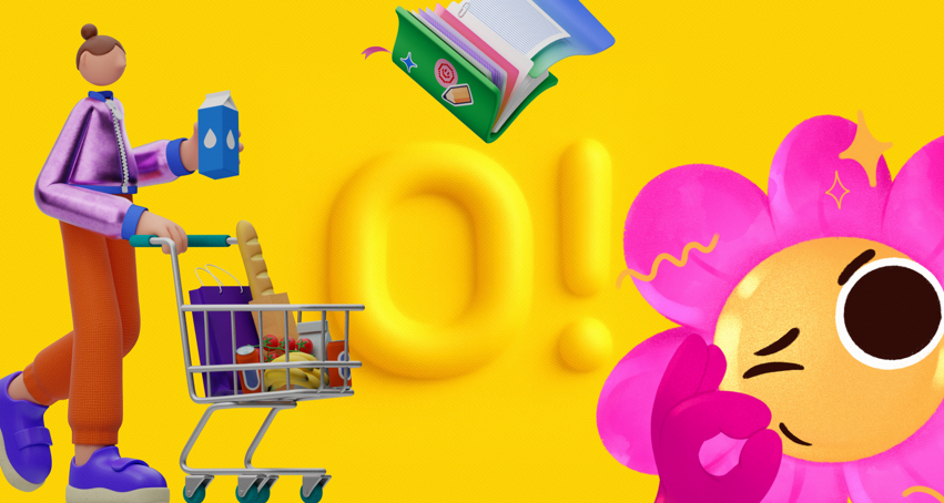
Generalist stock sites aggregate uploads from thousands of varied contributors. Ouch takes a different route, categorizing its 28,000+ business and 23,000+ technology illustrations into specific “Styles.”
Browsing the library isn’t just about searching for “man with laptop.” You select a visual language first-be it “Surreal,” “Sketchy,” “3D,” or “Flat.” Once you pick a style, every asset within that filter shares the same stroke width, color palette, and character proportions.
Designers need coverage across a full user flow, not just one pretty image. A typical style pack includes assets for:
- Hero sections (complex scenes)
- Empty states (waiting, error messages, 404s)
- Functional spots (login, add-to-cart, checkout)
Scenario 1: The Fintech App Overhaul
Picture a UI team redesigning a mobile banking app. They need to move away from cold, corporate photography to something approachable. But they don’t have the budget to hire an agency for a full brand refresh.
The Selection Process
The team filters Ouch by “Finance” and “3D.” They bypass the hyper-realistic renders and settle on a soft, clay-morphism style (one of the 44 available 3D styles). This immediately sets a friendly tone.
Implementation
Downloading random JPEGs won’t cut it. They grab the source files. For the onboarding screens, they use `.mov` or Lottie JSON files to add motion to the welcome sequence. For the dashboard, they download static PNGs of wallets and coins.
The Consistency Check
Because they stuck to one specific style pack, the “insufficient funds” error screen looks like it belongs to the same family as the “savings goal reached” celebration screen. Lighting, texture, and character design remain consistent throughout the user journey. It mimics a proprietary design system perfectly.
Scenario 2: The High-Volume Content Engine
Marketing teams face a different problem: speed. A social media manager might need three graphics a day for different platforms.
The Search Workflow
The manager needs a visual for a post about “remote team collaboration.” Searching standard stock sites usually yields generic photos of people high-fiving in a conference room. On Ouch, the manager searches for objects rather than just scenes.
Composition
They find a vector illustration of a team video call. But the default blue and white colors clash with the company’s distinct purple branding. Using the built-in recoloring tool before downloading, they map the illustration’s palette to their brand hex codes.
Adaptation
For the blog header, they need a wide format. For the Instagram story, vertical is required. They take the vector into Mega Creator (the integrated editor), move the elements around to fit the different aspect ratios, and export. The result is a branded asset created in minutes without opening Illustrator.
A Tuesday Afternoon: Fixing the Broken Flow
To understand how this works in a daily routine, let’s look at a typical task for a product designer.
It’s 2:00 PM. The developer pings you: the “No Search Results” state on the new e-commerce build is currently blank. It looks broken. You need a placeholder immediately, but it has to look intentional.
Open the Pichon desktop app (which syncs with the Ouch library). Don’t break your flow by opening a browser and logging in. Keep your design tool open on one side of the screen and Pichon on the other.
Search “magnifying glass” inside the app. Filter by the “Business” category to match the app’s serious tone. You spot a vector of a character looking confused at a giant empty folder.
Drag and drop the vector directly from Pichon onto your canvas. It’s a bit too complex for the small mobile container. Click to edit it in Mega Creator. Delete the background shapes, leaving only the character and the folder. Swap the folder color to match your UI’s accent color.
Export as SVG to ensure it remains crisp on retina screens. Hand the file to the developer. The whole process took roughly eight minutes. The empty state is no longer a bug; it’s a designed moment.
Customization vs. Cookie Cutter
Stock illustration often looks like stock. That is the main criticism. Ouch mitigates this through the Mega Creator tool.
Mega Creator isn’t just a crop tool. You can mix and match vector parts. Like a character’s pose but hate that they hold a laptop? Delete the laptop. Swap in a coffee cup, a plant, or even gold clipart elements for a luxurious aesthetic.
Because the assets are layered vectors (or tagged objects), you have granular control. Construct a scene that likely no one else has used, even though you are using public components.
Comparison with Alternatives
Freepik
Freepik is the volume king. Need a specific, obscure concept? They probably have it. But finding 20 illustrations that match perfectly is a nightmare. You will spend hours tweaking stroke weights in Illustrator to make them look cohesive. Ouch prioritizes the “pack” concept, making cohesion automatic.
UnDraw / Humaaans
These are excellent open-source resources, but they suffer from their own popularity. The “UnDraw look” is so prevalent in tech that using it can subconsciously signal “generic startup” to savvy users. Ouch offers 101+ styles, ranging from the trendy to the experimental, allowing for more differentiation.
Custom Commission
Nothing beats a custom illustrator for true brand ownership. Need a mascot that is integral to your IP (like the Duolingo owl)? Ouch is not the solution. Custom work is for core identity; Ouch is for scaling that identity across hundreds of touchpoints.
Limitations and when this tool is not the best choice
Ouch bridges the gap, but it is not a magic wand for every situation.
The “Specific Metaphor” Problem
Need a very complex, specific visual metaphor-say, “a cybernetic octopus fighting a bear to represent market volatility”? You won’t find it here. You will have to piece it together in Mega Creator, which requires a design eye, or hire an illustrator.
Free Plan Attribution
The free tier allows you to use the PNGs, but you must link back to Icons8. For a personal blog, this works. For a corporate landing page or a client project, having “Illustration by Icons8” in the footer looks unprofessional. Commercial client work practically demands the paid plan to unlock SVGs and remove attribution.
SVG Requirement
Serious web design requires SVG for scalability and small file sizes. Ouch locks SVGs behind the paywall. Sticking to the free plan limits you to PNGs, which can look blurry on high-res displays if not sized correctly.
Practical Workflow Tips
Integrate Ouch into your stack efficiently by following these rules:
- Commit to a Style ID: When you find a style you like, note its name or ID. Do not mix “Color Hand Drawn” with “Flat Geometric” on the same website. The clash jars the user experience.
- Use the 3D Sources: Have a 3D artist on the team? Download the `.fbx` files. Re-light and re-texture the models to create something that looks 100% custom.
- Check the Lottie Files: Before coding a static interaction, check if the illustration has a pre-made Lottie animation. Implementing a waving character on a “Success” modal adds significant polish with minimal dev effort.
- Use the Desktop App: The browser is fine, but the Pichon app allows for drag-and-drop into tools like Figma, Sketch, or Photoshop. It significantly speeds up the “try and see” phase of design.